Supervision Dashboard: your real-time control centre
You know the situation: you need to check the status of your systems, but the information is scattered across multiple tools. You manually refresh each page, mentally compile the data, and wonder whether what you're seeing is still up to date. That's exactly the problem we built the Supervision Dashboard to solve. It's a centralised control screen that gives you a complete view of your systems' health. No more juggling between interfaces or questioning the freshness of your data. Everything is gathered in one place, and information updates automatically.
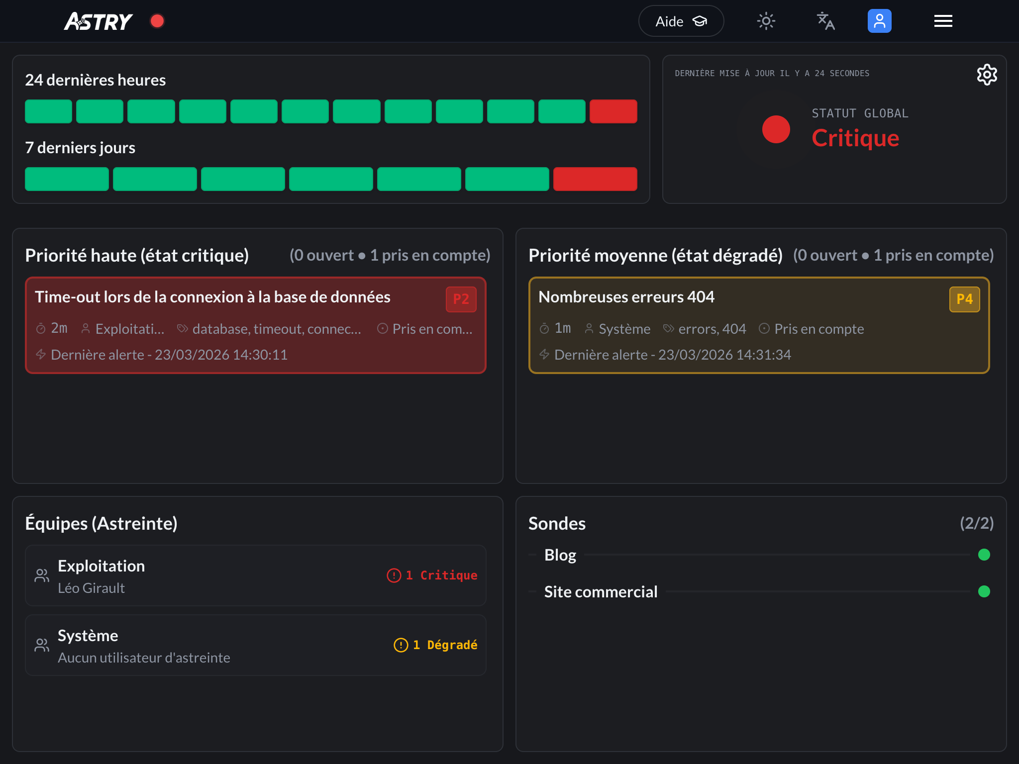 All the data you care about is displayed on your dashboard. An aggregated status ("Critical" in the screenshot) is computed and shown in the top-right corner of the screen.
The challenge we set out to solve
During the development of the Dashboard, and after many discussions with users, we identified two core needs:
- monitor the health of your systems continuously, without having to navigate between multiple tools
- understand trends in order to avoid repeating the same mistakes
Every organisation works differently. You may want to see everything, or you may prefer to filter and focus on what truly matters. That's why we placed a strong emphasis on customisation — which we'll detail below.
Key features
Automatic refresh
The dashboard updates automatically every 60 seconds. No more manually refreshing your screen every two minutes and wondering whether you have the latest data. This is especially useful for monitoring rooms where multiple screens display the dashboard continuously, or for on-call teams who need to react quickly. You can simply leave the dashboard open on a screen and it will keep itself up to date.
At-a-glance overview
The dashboard gives you a consolidated view of everything happening in your organisation. No need to navigate between multiple pages or mentally piece together information. A colour-coded indicator shows you the overall status of your organisation at a glance:
- 🟢 Operational: everything is working normally
- 🟡 Warning: minor issues have been detected
- 🔴 Critical: major incidents require immediate attention
The indicator pulses slightly when the status changes. Even if you're not directly in front of the screen, your eye catches the change. It's designed to draw attention in a subtle but effective way.
Advanced configuration
Every organisation works differently, so we wanted to make the dashboard fully customisable. You can adapt it to the way you work.
Block display
You can decide which blocks to show or hide:
- critical and degraded incidents
- the list of on-call teams
- monitoring probes
If you don't need to see teams because you're a small organisation (or because you only have one team), you can hide them. If you want to focus solely on incidents, you can hide everything else — it's your call.
Filter by tags
You can define tags to include or exclude. For example:
- include only incidents tagged "production" and "critical" if you want to see only what truly matters
- exclude incidents tagged "test" or "maintenance" to reduce noise
The same logic applies to teams and users:
- you can include only certain teams if you want to see only what falls within a specific scope
- or exclude certain teams if they handle elements that have no operational value for you
Define the priority mapping
You can define yourself which priorities map to which level:
- P1 and P2 in red (critical)? Or only P1?
- P3 in yellow (degraded)? Or P3 and P4?
- P4 and P5 in green (operational)? They won't even appear on the dashboard
You simply click on each priority (P1, P2, P3, P4, P5) to cycle it through green → yellow → red. It's visual and intuitive. This lets you adapt to your own way of classifying incidents. If P2 is already critical in your organisation, you can set it to red. If you're stricter and only P1 is critical, you can configure it that way too.
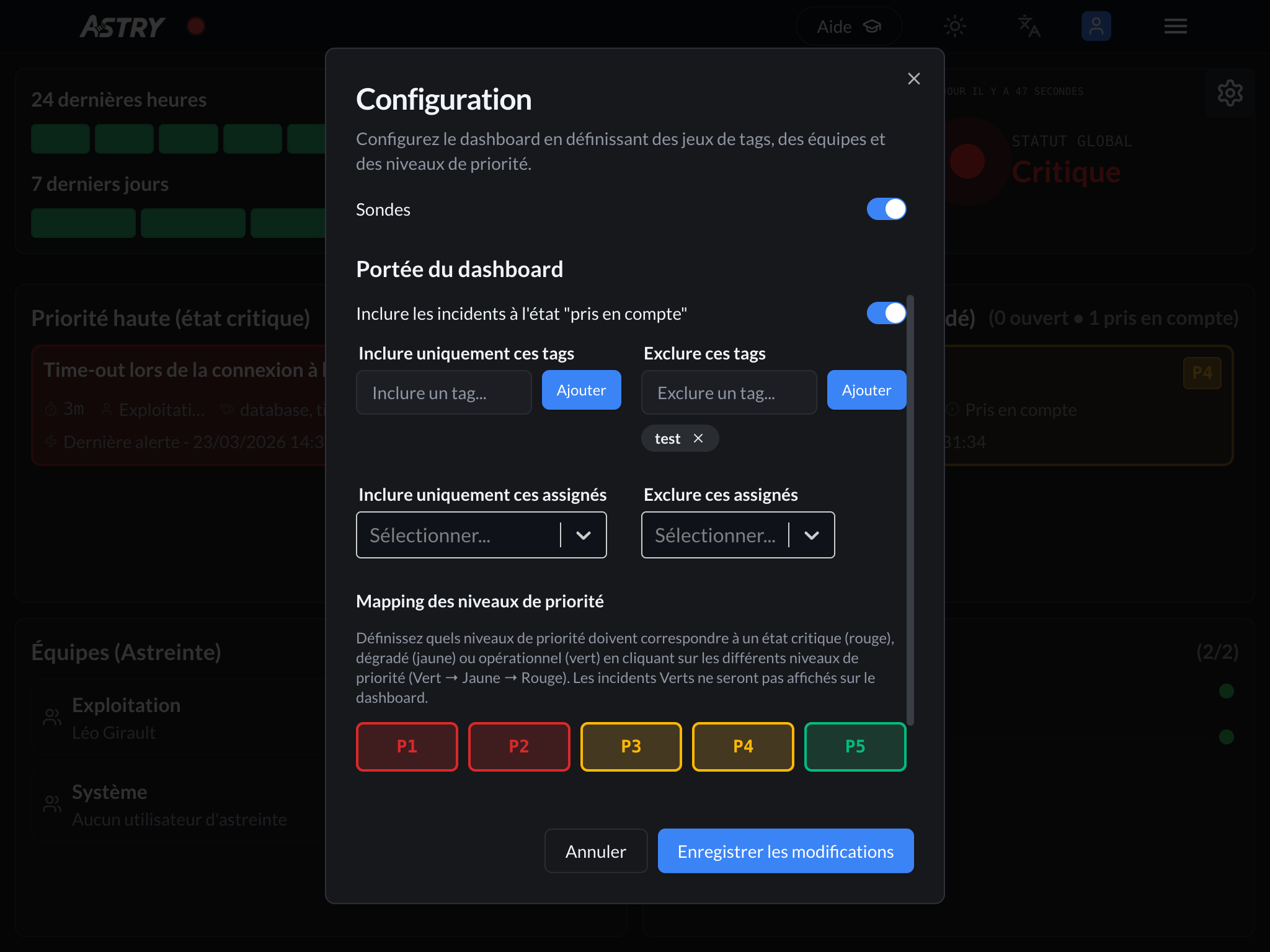 The gear icon in the top-right corner of the screen gives you access to the Dashboard configuration.
Show or hide Acknowledged incidents
You can choose whether to display incidents that are already acknowledged or whether to focus only on those that are still open. Sometimes seeing both is useful; sometimes it just adds noise.
Organisation-level configuration
All of this configuration is saved at the organisation level. Once you've set it up, every member of your organisation sees the same customised dashboard. No more mentally re-sorting information every time.
Information in detail
History and trends
Two bar charts let you analyse how your infrastructure is evolving:
- The last 24 hours: Visualise the state of your systems in 2-hour slots. Useful for determining whether a problem has been going on for a long time or has just appeared.
- The last 7 days: Identify recurring patterns. Do you always have issues on Monday morning? Does things calm down over the weekend? This kind of analysis becomes possible.
Colours are intuitive (green = all good, yellow = caution, red = problem), making it easy to quickly spot problematic periods.
Incident and crisis management
The dashboard automatically classifies your incidents by priority. No more manual sorting. It then distinguishes between critical and degraded incidents based on your configuration. Open crises are also displayed prominently, with a special badge so they're easy to spot. When a crisis occurs, you can't afford to miss it.
Teams
A dedicated section shows you your teams. You can see:
- The number of incidents (critical and degraded) for each team
- The person currently on call for each team
This is very handy for identifying at a glance which areas are affected.
Probes
The dashboard also displays the status of all your probes. You can see:
- the status of each probe (operational, degraded, or down)
- and the priority of the incident that was raised
Concrete benefits
Time savings
No more manually refreshing every two minutes. No more juggling between tools. Everything is in one place and updates automatically. You can simply leave the dashboard open and glance at it from time to time.
Built for monitoring rooms
The dashboard can be displayed in full-screen mode. It's designed for it. You can put it on a large screen in your monitoring room, control centre, or war room during a major incident. It runs continuously and everyone sees the same thing.
Summary
Whether you're a small startup or a large enterprise, the dashboard adapts to your needs. You can configure it to display exactly what matters to you, and nothing more. It's a tool that saves you time, improves your responsiveness, and helps you make better decisions. Feel free to try it for free on your Astry account or contact us to arrange a demo.